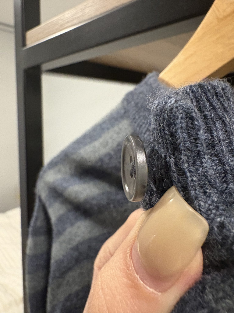
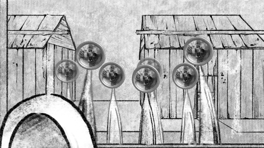
The first version had too heavy colors and did not match the picture. The second version had too high brightness, which was difficult to distinguish on the picture. We need buttons with strong contrast and clear structure, preferably with light shining through from above to illuminate them. This way, the structure can be easily recognized and the light source is the same as that of the protagonist’s button in the picture. So we re-shot a version in real life.
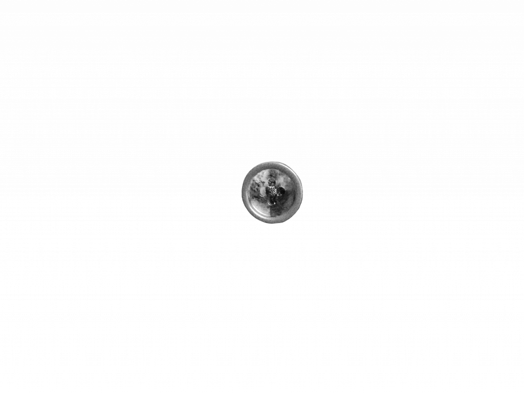
Final
Leave a Reply